350
Graphics + Visuals
Visual Style Guide, Logos + Resources
Goals
- Attract and engage people
- Make our messages clearer and stronger
- Be easy for non-designers to use
- Express 350's values and personality
Basics
| 350 is: | How it shows in our style: |
|---|---|
| Optimistic, Bold, Energetic |
|
| Clear-eyed, Practical, Direct |
|
| International, Diverse, Grassroots |
|
Colors
Colors sized proportionally, relative to how much they're used in 350's style.
Blue is 350's main color — whatever you're making, it should probably have blue in it.
White, light gray, and dark gray are the secondary, neutral colors. Good for backgrounds, and balancing out the brighter, more intense colors.
Orange is the main accent color. Use it for buttons, highlights, and calling attention to the most important parts of your design.
Teal and Red are secondary accent colors. When you're already using all the other colors, teal and red can provide variety and give you more alternatives to work with.
Color Codes
Blue
Hex: #0F81E8
RGB: 15,130,232
CMYK: 78,47,0,0
White
Hex: #FFFFFF
RGB: 255,255,255
CMYK: 0,0,0,0
Light Grey
Hex: #E6F0FA
RGB: 230,240,250
CMYK: 84,65,60,65
Dark Grey
Hex: #17292E
RGB: 23,41,46
CMYK: 84,65,60,65
Orange
Hex: #FFA902
RGB: 255,170,2
CMYK: 0,40,100,0
Teal
Hex: #40D7D4
RGB: 64,215,212
CMYK: 60,0,25,0
Red
Hex: #FF6112
RGB: 255,97,18
CMYK: 0,76,100,0
Text
Big, bold and simple are the key elements to 350's typography.
- Titles and headlines should be big and bold.
- Paragraphs should be left-aligned and rag-right (the default setting for most left-to-right written languages).
350's written voice is clear and plain-spoken, and our typography reinforces that. When you're styling text, make it simple and straightforward — don't overthink it!
In general, 350 uses the inverted pyramid as a way to organize text: identify the most important information, put it at the top, and make it big.
All typefaces used by 350 are free for non-commercial use.
Photos
People
People are the heart of the climate movement — photos should focus on the people impacted by the climate crisis and working to create a better future. Avoid photos of polar bears, icebergs or other images that obscure the real people behind the climate crisis.
Diversity
The climate movement crosses cultural, geographic, racial, age, gender, religious and political boundaries. Photos should reflect how massive and diverse the movement is.
Energy + Momentum
People moving, shouting, singing, smiling — 350 photos should help people feel like they’re part of a big, powerful, ambitious movement. Good: Crowd shots that fill the frame, and images of people in the middle of taking action.
Crediting photographers: Good photos are crucial to 350's visuals, and it's hard to get good photos without good photographers. Make sure to credit the photographer, and don't use photos without permission.

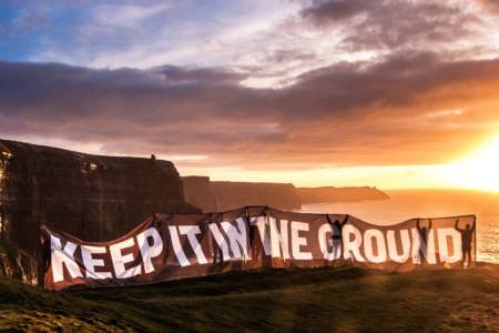
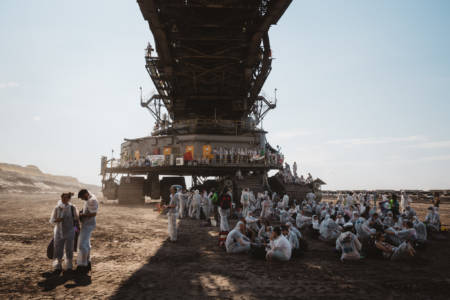
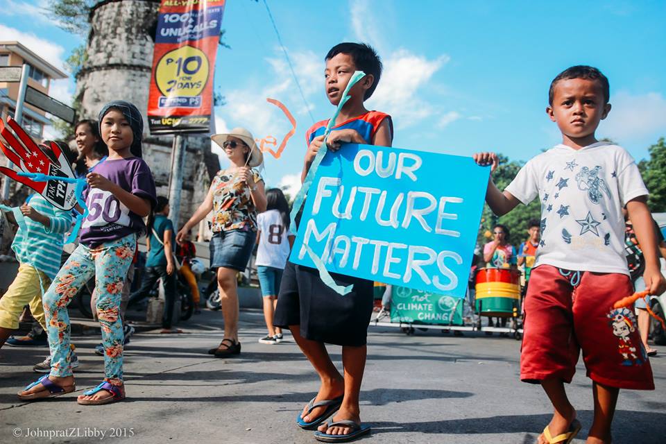
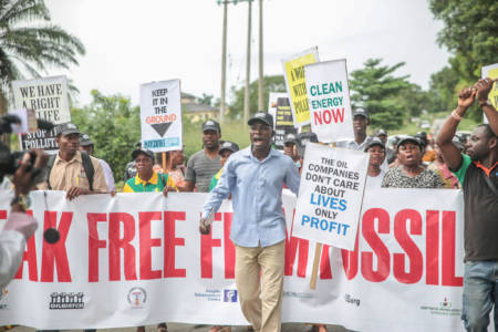
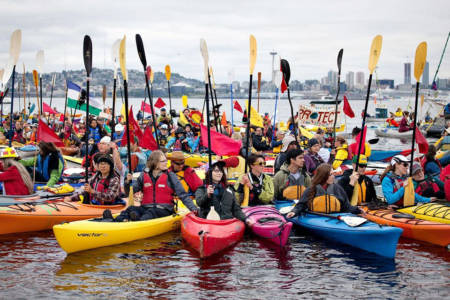
Photos, from top left: New York City, USA (Christine Irvine). Cliffs of Moher, Ireland (Eamon Ryan). Ende Gelande, Germany (Moritz Richter). Dumaguete, Philippines (Therese Quijano). Oloibiri, Nigeria (Babawale Obayanju). Anacortes, Washington, USA (unknown).
Logo
In general, 350's style relies more on fonts, color and content than on the logo.
When placing the logo, it's usually good to make it small and put it towards the bottom of whatever you're making.
Formats
.PNG is best for most common uses, and can be used just like a .jpg file.
.SVG is better for use in design software.
Main Versions
Symbols
Use icons from 350’s icon set to enhance and call attention to key elements and reinforce the cross-language, cross-culture nature of 350’s work.
A note about using maps:
When using maps, make sure to use maps that represent countries fairly. For example, the common Mercator projection makes Greenland look the same size as Africa — in reality, Africa is 14 times larger than Greenland (the map in the 350 icon set uses the Robinson projection).
