350
350's Brand Toolkit
Resources for Creators
This page is your one-stop shop for brand guidelines and resources available for creators, local groups, partners and activists to produce their own content aligned with our brand and standards.
350’s brand is founded on bold and crisp visuals. Vibrant and authentic “people power” visuals are central to disseminate our message, and raise awareness of the issues with which we are involved – people power taking on the fossil fuel industry. 350 visuals should reflect our identity and our core value of climate justice. When using the resources, aim for clear, compelling visuals, which embody elements of both our identity and our campaign work.
Logo
When placing the logo, it's usually good to make it small and always ensure to use the proper color version that contrasts with the background.
As legibility is the key, a clear-space must be maintained on all sides of our logo, in this way we make sure we have enough air around that makes us visible between others. The minimum exclusion zone margin for the logo and logotype is based on the width of the number “0” from our logo. On all sides, the exclusion zone should be measured from the farthest edge of the logo. No other element that is not from our brand may encroach on this space.
Text
Big, bold and simple are the key elements to 350's typography.
350's written voice is clear and plain-spoken, and our typography reinforces that. When you're styling text, make it simple and straightforward — don't overthink it!
All typefaces used by 350 are free for non-commercial use.
Colors
Blue is 350's main color — whatever you're making, it should probably have blue in it and our neutral tones (light gray and dark gray).
Orange, teal and red are our secondary colors, they complement the primary colors, and could be used when the primary colors are not enough.
In order to consider the accessibility of all our material, it’s important to use only one bright color (blue or secondary colors) in our material, alongside our neutral tones. That will ensure all 350 resources are always visible and readable.
Color Codes
Blue
Hex: #0F81E8
RGB: 15,130,232
CMYK: 78,47,0,0
White
Hex: #FFFFFF
RGB: 255,255,255
CMYK: 0,0,0,0
Light Grey
Hex: #E6F0FA
RGB: 230,240,250
CMYK: 84,65,60,65
Dark Grey
Hex: #17292E
RGB: 23,41,46
CMYK: 84,65,60,65
Orange
Hex: #FFA902
RGB: 255,170,2
CMYK: 0,40,100,0
Teal
Hex: #40D7D4
RGB: 64,215,212
CMYK: 60,0,25,0
Red
Hex: #FF6112
RGB: 255,97,18
CMYK: 0,76,100,0
Videos
Videos are a great tool for telling a story in a different and more accessible way.
If you’re looking for more video content about actions, mobilizations and campaigns, please visit our YouTube channel.
B-roll footage from 350.org projects is available to aligned filmmakers and news organizations covering the climate movement or promoting climate action, with clear attribution and/or thanks to 350.org. Create an account with the 350 Media Library for access.
350 has also been involved in the production of several long-form films that document the work of the climate movement. You can check those at our 350.Trainings website, under “Multimedia”.
This is the video explaining our Theory of Change.
Photos
Photos are a powerful way to showcase the power and diversity of our movement.
Good photos are crucial to 350's visuals, and they should be aligned with our core values:
People
People are the heart of the climate movement — photos should focus on the people impacted by the climate crisis and working to create a better future. Avoid photos of polar bears, icebergs or other images that obscure the real people behind the climate crisis.
Diversity
The climate movement crosses cultural, geographic, racial, age, gender, religious and political boundaries. Photos should reflect how massive and diverse the movement is.
Energy + Momentum
People moving, shouting, singing, smiling — 350 photos should help people feel like they’re part of a big, powerful, ambitious movement. Good: Crowd shots that fill the frame, and images of people in the middle of taking action.

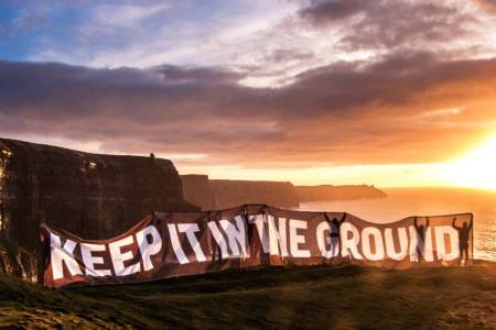
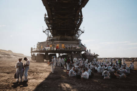
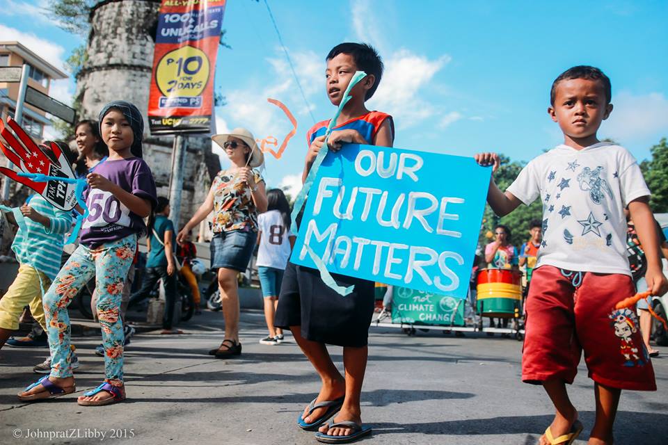
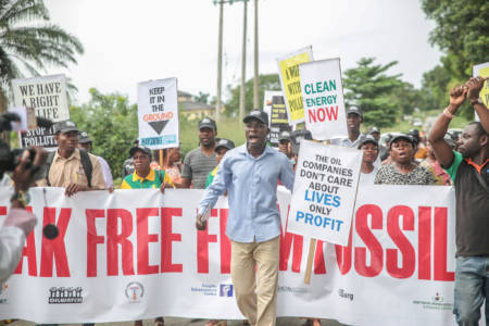
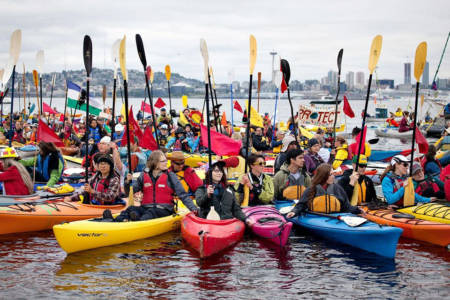
Photos, from top left: New York City, USA (Christine Irvine). Cliffs of Moher, Ireland (Eamon Ryan). Ende Gelande, Germany (Moritz Richter). Dumaguete, Philippines (Therese Quijano). Oloibiri, Nigeria (Babawale Obayanju). Anacortes, Washington, USA (unknown).
IMPORTANT: make sure to credit the photographer, and don't use photos without permission.
Looking for photos from 350 actions? Want to find images to use in climate education materials or for event recruitment? Create an account with the 350 Media Library for access.
Symbols
Use icons from 350’s icon set to enhance and call attention to key elements and reinforce the cross-language, cross-culture nature of 350’s work.
A note about using maps:
When using maps, make sure to use maps that represent countries fairly. For example, the common Mercator projection makes Greenland look the same size as Africa — in reality, Africa is 14 times larger than Greenland (the map in the 350 icon set uses the Robinson projection).
More info
Didn’t find what you were looking for?
Are you looking for training resources on storytelling and how to spread your message?
